
This plot of kinetic energy versus momentum has a place for most moving objects that folks encounter in everyday life. It shows objects with the same kinetic energy (horizontally related) that carry different amounts of momentum, as well as how the speed of a low-mass object compares (by vertical extrapolation) to the speed after perfectly inelastic collision with a larger object at rest. Highly sloped lines (rise/run = 2) mark contours of constant mass, while lines of unit slope mark contours of constant speed. Parallel contours are separated by intervals of three orders of magnitude, so objects from small (radio frequency photons) to large (the observable universe) are included. The top and right axes are labeled in practical units, while the bottom and left axes show SI unit values of the quantities being graphed. The plot further illustrates where lightspeed, Planck's constant, and kT figure in.
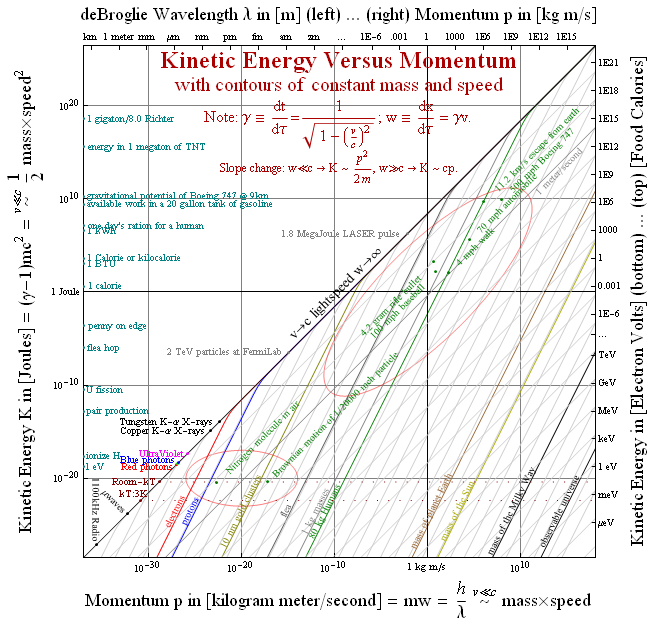
 The centered diagonal-line running from lower left to upper right is a "curtain of finite lightspeed c" that Newton had no reason to expect. When the curtain is in place redirecting lines of constant mass asymptotically onto v=c, only the lower right half of the plot is accessible. For most of that accessible area Newton's approximations work pretty darn well. Although coordinate velocity v=dx/dt is a dead-end variable near its upper limit, proper velocity w=dx/dτ andmomentum p=mw as well as relativistic energy γmc2 remain useful on both sides of w=c. The resulting slope-change in energy versus momentum is in practice verified every time someone examines electron-wavelength as a function of energy, e.g. using the transmission electron microscope at your neighborhood hospital. Note that the location of thatelectron elbow is determined by the metric conversion factor c between meters and seconds, which also limits the rate at which photons can move.
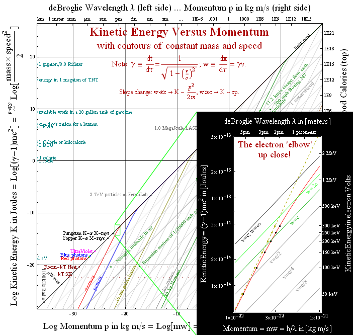
Planck's constant h determines the deBroglie wavelength (useful for objects of low momentum), and kT yields thethermal energy: per nat of state uncertainty as well as per pair of quadratic modes for distributing heat. Thermal kinetic energy of translational motion in 3D is therefore about (3/2)kT per particle. Note that the relationship between the energy and momentum (also frequency and wavenumber) of an object is called its dispersion relation. Such relations can be plotted for non-vacuum media on this graph, thus illustrating for example the concepts of medium-conferred effective mass and frequency-dependent refractive index. For ring rotators of given density one can also superpose in the lower left corner of this plot the freeze-out zone due to angular momentum quantization, which requires that the rotator's deBroglie wavelength span the ring's circumference an integral number of times.
What are some other things that might be fun to plot on such a graph? A partial list begins here...
- A moving snail.
- Myosin molecule moving along an actin muscle fibril.
- 300 keV microscope electron.
- 1/refractive index dispersion profile for light in glass.
- A line for the mass of the observable universe.
- Recoil energy of the earth when you fall off the roof (down near kT).